Alternative Views
“What do you use two monitors for?… You mean your mouse cursor can move from one screen to another?!”
It’s a rather common question I face when friends see my computer setup. I don’t blame them for asking thus. After all, whenever I did a dual-monitor setup at work to improve my productivity (while reducing Alt-Tabbing), I get a collection of interesting questions too!
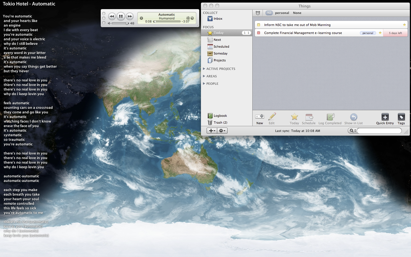
Here’s how my secondary desktop at its idle-state looks like with iTunes playing a random track:-
You’ll see DesktopLyrics (with GimmeSomeTune, an automatic lyrics fetcher), iTunes, EarthDesk, and Things as permanent residents in this secondary-screen estate.
Other times, I have Google Chrome running on the bottom-right of the screen with 4 tabs, one for Facebook, another for Gmail, then Munin, and the last for Torrentflux. Safari is still my main browser but I use Chrome for these few site due to its stability and resilience to crashes. The Adobe Flash plugin crashes all the time, so will intensive AJAX sites. I’ll explain why Safari is still my main browser on the Mac in another post. I also use this screen to watch YouTube (in Chrome) or videos.
On my main desktop, I run something called iCalViewer which overlays my iCal calendars over my desktop wallpaper, with events represented by boxes all racing towards the finishing line, i.e. the time now—visit the product page for a good visualisation. This is also the place where I have my primary focus, for reading or for writing. All references go to the secondary screen on the right.
With the invention of widescreen (16:9) monitors, I now partition the screen area to 2 virtual areas. The standard 4:3 area for work, and a tiny vertical 4:9 strip for all other notifications and communication windows. Never under-estimate what this 4:9 vertical strip of space can do, as it has saved me countless of Alt-Tabbing actions and ‘situation awareness’.
I put my various contact-lists (Adium and Skype), Growl notifications, and chat-windows in this vertical space. Only Adium (and countless other non-official IM clients) can consistently and compactly display a chat window into a 4:9 space while retaining usability and readability. This means, the chat-window consists of only a one-liner text entry box and fills the rest of the vertical space with conversation—no formatting toolbars and fancy-feature buttons (think Google Talk client). With tabs right below the text entry box, I can switch between conversations with a click or key-press. Application-specific floating toolboxes or palettes live in this space too.
Another reason why I keep my workspace and web browser in the 4:3 layout and not filling the entire 16:9 widescreen is because of 2 main considerations.
Firstly, according to screen-readability and eye-tracking studies by Google, reading habits of most people are only concentrated on the top-left vertical column of the screen. In short, the eyes prefer travelling in small vertical motions rather than large horizontal distances. This also explains why newspapers typeset text in columns as our eyes have less horizontal travelling to do.
Secondly, most webpages are designed with the resolution of 1024 by 768 pixels in mind, a 4:3 aspect ratio as a lowest common denominator. Stretching the browser window too much horizontally either stretches the site horizontally unnecessarily or that there will be unsightly and uneconomical empty spaces surrounding the site content.
So as to reduce strain on my eyes, I restrict most windows to a 4:3 size ratio unless the application design requests otherwise (Adobe Photoshop is a prime 16:9 example).
This also explains why whenever I’m browsing or navigating for files in Windows or any other application for that matter, I restore (un-maximise) the window, resize it to 4:3 size ratio and turn on ‘Detail View’. I locate stuff way faster by just looking downwards compared to scanning left-right-down, left-right-down.
In fact, I have personally observed the reading efficiency of Windows-users who habitually maximise windows, regardless of the display aspect ratio. Sad to say, their bad-habit negatively affects their productivity. It’s nothing scientific but it’s highly amusing.
Of course, all these window arrangements can only be achieved consistently on the Mac as Windows has amnesia when it comes to remembering windows positions and sizes. This also explains why Windows-users have to habitually maximise their windows—it is the only reliably and quick method to get windows into predictable (and familiar) positions and sizes.
So please, when you’re on a Mac, don’t be frustrated that the green ‘maximise’ button doesn’t work as you’d expected. It’s not meant to! Don’t be lazy but to just position and resize the window into a 4:3 size ratio and the application will remember it; yes, both size and position. If you’re unfortunately on Windows, like I am during working hours, don’t fret—some applications will remember window size and positions; just adjust for those that don’t. If you value productivity, that is.
 Ronald's Scribblings